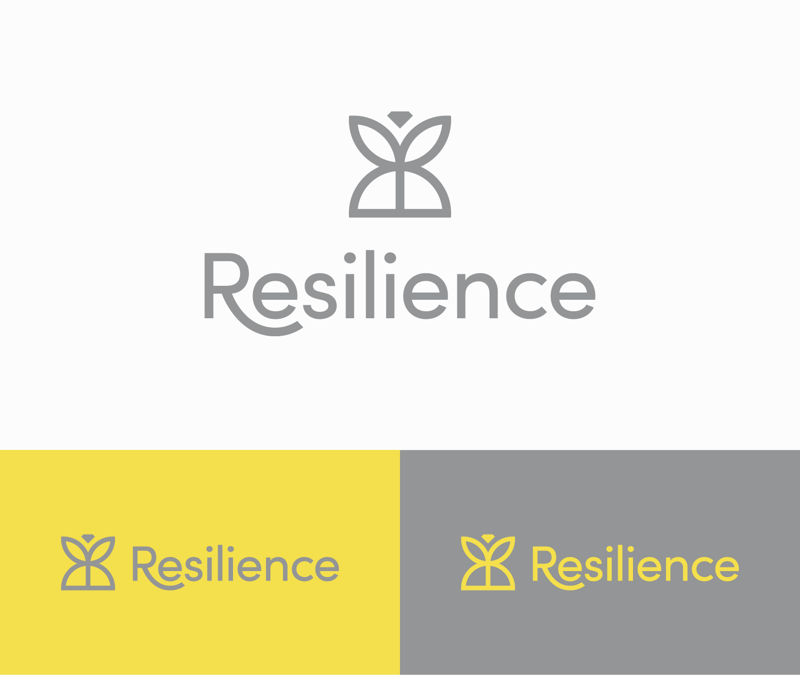

Beginning with two symmetrical “R” shapes, a seedling, a rising sun, and a diamond form a mark that resembles a butterfly—symbols of growth and hope. Diamonds, while central to Paris Jewellers, are also a symbol of light and strength.
Alternative Explorations

The first design is a more abstract mark formed by interlocking shapes inspired by a flower and a sun to symbolize strength and togetherness.
The second mark is a badge-style treatment depicting a growing plant and a sunrise—symbols of hope, growth, and strength—encompassed by a circle for strength and togetherness.
Resilience Collection Logo
Resilience by Paris Jewellers is an exclusive jewellery collection inspired by the tremendous resiliency of Canada’s frontline workers and the 2021 Pantone Colors of the Year, Illuminating and Ultimate Grey. This line features a softness in shades, strength in design, and contrast in warm and cool tones with citrine, grey moonstone, and diamonds crafted in yellow gold and sterling silver.
Goal: Design a logo that is unique, elegant, and captures the ideas and symbolism behind the Resilience line.
Keywords: Brightness, hope, strength, togetherness, elegance
Team
Paris Jewellers
Year
2021
Categories
Branding
Skills
Adobe Illustrator


